Bauwerk
LITexpo pavilion
Paleko ARCH studio - Vilnius (LT) - 2006

Exhibition pavilion, Vilnius
Paleko ARCH studio skilfully strenghten the sense of place of a former flood plain by making as little of an actual facade as possible.
15. November 2006 - Bartenis Šiaulytis
The city of Vilnius has an amazing array of unique spaces, the quality of which is often attributable to the city’s natural assets. For thousands of years the Neris River has been picturesquely sculpting the city’s terrain: urban developments span several levels and often command majestic views.
Vilnius’ Litexpo exhibition centre is conveniently located in one such remarkable space – a former flood plain whose eastern and northern flanks are confined by the winding river and a steep, forest-clad hill. Just across the river is Vingis park – a favourite venue for outdoor events and a perfect place for a stroll. One of the city’s major traffic arteries now cuts through the south-west corner of the flood plain and leads up the hill to the soaring residential towers of the 1970s Lazdynai district. Interestingly, the Expo buildings themselves are hidden from passing traffic by the trees. The original 30-year old pavilion and its newer, rather temporary-looking neighbours were judged too small to handle the crowds and an expansion project was established to boost capacity and revamp the entire site.
Strengthening the „sense of place“ was listed as one of the primary requirements in the competition brief for the new pavilion. Other design tasks included unification of the existing pavilions into a functional whole and the creation of a new visual landmark for the central expo piazza, while still allowing for a continuum of space.
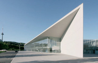
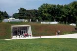
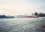
These requirements have been skilfully met in the winning proposal by architect Rolandas Palekas and his team. The proposed structure is a simple triangle in plan – in itself a rather unusual choice, as the square „box“ all too often seems to be the standard response to the utilitarian function of a pavilion. The geometric triangular design is both respectful and significant: its diagonal face redirects and emphasizes views towards the surrounding green hills and introduces a healthy dose of architectural dynamism to the central piazza, while the rectangular rear blends functionally with the existing grid.
The most prominent feature of the new building, its diagonal elevation – or rather opening – is thus revealed as if by cutting an imaginary enclosed square volume. The vibrant, reflective glass screen encourages visitors to wander around without being constrained by a sense of „inside“ and „outside“. Actually, the architects’ design statement reveals a deliberate intention to eliminate the main elevation in favour of the smooth transition of space. The diagonal „cut“, the longest facade, allows daylight to flood the building. To further emphasize the overlapping of inside and outside spaces, the roof extends out over the glass screen, creating a canopy in front of the building. Dramatically touching the ground with a sharp-angled corner, the concrete structure of the pavilion also becomes the high point of the Expo piazza, without being in any way intrusive or pretentious.
The inner space of the pavilion faithfully echoes the exterior’s crystalline, structural appeal. The 12-metre-high, 2000-seat conference hall space was designed for adaptability from the very start. All service areas are hidden in low-rise volumes outside the almost windowless rectilinear walls, thus maximizing the usable internal space. These external projections house a cafeteria with outdoor terrace, a 200-seat conference hall, staff rooms, cloakrooms, rest rooms as well as vertical and horizontal circulation. There is a technical basement underneath the entire structure.
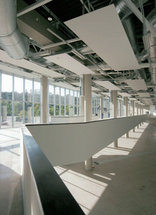
The interior treatment is rather minimalist, in keeping with the idea of the prism-like external shell. The most prominent feature is a mezzanine level, or rather a wide balcony, running all the way along the inside of the diagonal facade at a height of four metres above ground level. Raised on columns (which also support the roof), the mezzanine overlooks the activity areas on either side of the dividing glass screen. It provides additional display space and is accessible via a staircase encased within solid balustrades – an almost sculptural artefact in the visually restrained pavilion.
Opened this September, the pavilion is just in time for some of the most popular exhibitions and for the „free“ show of autumn colours on the surrounding hillsides.
Für den Beitrag verantwortlich: A10
Ansprechpartner:in für diese Seite: Hans Ibelings
