Bauwerk
Commercial building, Užice
Neo arhitekti - Užice (SRB) - 2007
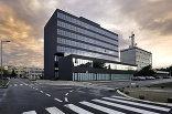
Commercial building „Textil“
NEO arhitekti’s answer to a very constrained context is to expand inwards.
26. April 2013 - 360BEOGRAD
Can something which is constrained nevertheless expand itself? NEO arhitekti deliver a surprising, yet familiar answer: one can, in fact when the outer limits are reached, always develop inwards.
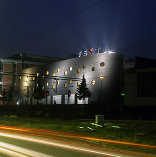
The location of Užice entails, that almost everything here is constrained. The town lies in the narrow basin of the river Đetinja and is enclosed by the Zlatibor and Tara mountain ranges. Situated here is the commercial building „Textil“, created from the expansion of a conventional 50’s warehouse. Actually the new building has literally swallowed the old, and further approached the outer limits of the site. „Textil“ has therefore continued its development internally. Doing so it has retained yet jazzed up the industrial charm. The success of the design is due, not only to the architects, but also to the client. The planning process was pursued with very good co-operation and understanding. The company, established in 1991, recognized that architecture itsself can considerably enhance a company´s corporate identity.
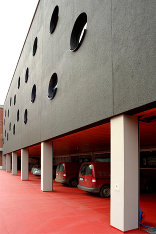
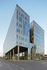
„Textil“ is located within the industrial zone of Užice, more precisely between the motorway, the railway, the warehouses, a football field and lastly, a cemetery. The surroundings could not be more dissimilar. Added to this, the industrial zone is bit by bit transforming itself into a commercial centre. If the only constant is change and the only context is heterogeneity, where does one begin planning, and all that in a constrained space? Snežana Vesnić and Vladimir Milenković have delivered an unbiased design which they themselves describe as „anti-design“, as a reaction to the surroundings and context. Despite this forceful dadaist expression a frolicsome building has been created. The architects have themselves turned away from all that which they have no influence upon to concentrate on the interior. The result is an introverted building which publicly exhibits only its perforated façade but reveals nothing of its interior life. What has been achieved is an efficient room programme and, as a contrast to this programmatic severity, a rather playsome façade which defies its surroundings. Contrast is a recurring theme in this project.
The reserved nature of the building is not only a measure of delimitation from its heterogeneous surroundings but also of protection from the extreme climate which is marked by strong temperature fluctuations during both summer and winter. The building breathes from the inside out: it has its own microclimate, which is regulated by a one storey-high, extensive atrium and eight rooflights on the flat roof.
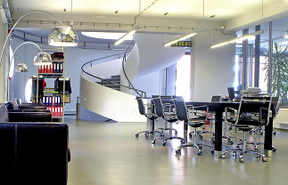
Although the old structure has been completely absorbed by the new, it is clearly defined by rectangular columns and visible beams, whilst the new structure utilises stronger floor slabs, which are supported by circular columns throughout. Two homogeneous, gently coiled concrete staircases, connect the ground floor reception area with the upper floor offices. These are the focal point of the public area. The colour concept is one of contrast, alternating between black and white: a black façade, white interior walls and industrial flooring. The surface of the façade is made of finely ground marble. Measures had to be taken to forestall cracking in the façade by the marble overheating. Movement joints were incorporated and the black surface has been brightened by adding a 20% mix of white marble.
The majority of the furniture has been designed by the architects themselves. The black and white motive is further strengthened with the choice of the interior décor: white in the public areas, black in the office areas. To relax the stark colour concept and to add a little playfulness to the interior, the architects came up with an idea: gymnastic equipment, wall and horizontal bars in warm timber tones have been integrated, for gymnastics, what else! Otherwise for the unfurling and presentation of textiles which afterall is the purpose of this building.
An earlier version of this text was published in A10 #16. (Text: Vesna Vučinić)
Für den Beitrag verantwortlich: 360BEOGRAD
Ansprechpartner:in für diese Seite: nextroom
Akteure
ArchitekturBauherrschaft
TEXTIL
Tragwerksplanung
Fotografie
