Bauwerk
Worm Re-)Create
2012 Architecten, Atelier van Lieshout - Rotterdam (NL) - 2011
28. Januar 2012 - newroom
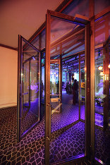
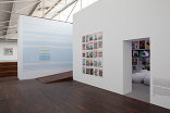
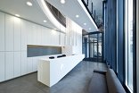
WORM, the institute for avant-garde recreation, has left their temporary quarters at the Achterhaven and has moved to a nineteenth century complex on the cultural axis of Rotterdam, the Witte de Withstraat. Their new accomodation, like the previous, is also designed by 2012Architecten. WORM is one of the users of the premises where previously the Dutch Photo museum was housed. The spacial design is based on the main structure of the existing location. By making a great cut in the side facade and the intermediate floor, all functions are spacial connected in the building. The cut section is re-situated two meters in front of the facade. Behind the entrance, the hall holds three functions; the public, the offices/studios and the house/bar. Each of these functions have been materialised in their own way. The overall theme for WORM is transparency. That's why windowpanes are placed between most spaces to keep the view between the office staff and the public. This is also visible in the intervention in the facade, an open staircase where you can view the luminous toilets and the way the foyer, hall and smoking area are connected to each other.
Public spaces
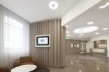
The floors and panelling give the public spaces their character with applied Trespa remains. These panels have been sand-blasted in surreal Arabic patterns. The white brown Trespa, in combination with the acoustic wall and ceiling panels (originating from an Indonesian Airlines Airbus), the NS orange airplane chairs and the airport lamps, create a exceptional kind of „Nouveau Chique“ look. The hall's walls and ceiling are finished with airplane interior panels where all the technical systems are hidden behind; ventilation system, grid, lighting plan and sprinklers. By designing it this way, the competence has become invisible and the spacial- and light experience are more dominating.
Offices & Studios
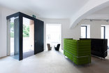
The offices and sound studio's have mainly been designed by Atelier van Lieshout based on the spacial design structure by 2012Architecten. AVL has chosen to weld the walls out of heavy rusted steel panels. A kind of fortification, literally, to filter the sound out from the hall but also in the figurative way to entrench against the next crisis.
House & Bar
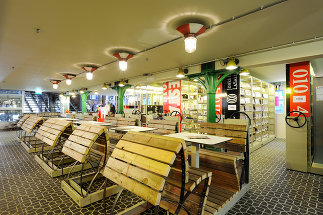
The house, the bar and the filmstudios have been fitted into the existing smaller spaces of the basement. Here, the atmosphere is determined by the present functional tiles and installation technology. By applying a series of toilets, made out of liquid containers (Marc Heumer) and oak wood furniture (Jasper van der Made), it completes an alienated postindustrial atmosphere. In the shop and foyer the rolling archive cabinets have been reused, as they were previously owned by the Photo Museum and found in the cellar. For the LP, CD, DVD, Superuse shop and the lockers this system has been applied by which the space is utilised efficiently in it's original function. The part in front of the bar there are ten of these frames with four persons seats, composed more spaciously. As soon as clients discover that their seats are mobile, this creates different kinds of social encounter.
Für den Beitrag verantwortlich: newroom
Ansprechpartner:in für diese Seite: nextroom
Akteure
ArchitekturBauherrschaft
WORM
Fotografie
.jpg)
