Bauwerk
Rožmarin restaurant, wine bar and cafeteria
AKSL arhitekti - Maribor (SLO) - 2006
21. Dezember 2006 - Architekturarchiv Slowenien
In the beginning of 2005 investors bought an old department store in the pedestrian area of old city of Maribor. The building is a quality modernistic architecture from 60’s and is a cultural monument. The author was local architect Borut Pečenko.
From very beginning on, the building encountered several changes of programs and its owners.
Since the building is cultural monument and strongly monitored by city’s service for preservation of cultural heritage, the task for investors to make something completely new was even harder.
The building was in terrible shape and it needed whole through reconstruction. Their concept was to join mixed programs such as boutiques, children’s shops, children care, restaurant, wine bar and cafeteria in one circulating and vivid space. They hired a well-known architect Heinz H. Brunner from Wienna, specialized in shopping centres, to do the idea project of renovation of whole building. In his idea project areas for different programs were given and new and more functional communications were proposed. He also proposed new glass facade to south, as a preservation skin of existing building. Somehow the service for preservation of heritage accepted this idea and investors started looking for local architects to develop plans for realization.
In July 2005 our office was invited to competition for interior design and got a commission for 900 m² of restaurant, wine bar and cafeteria space.
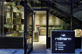
The whole space is divided in five levels, but still strongly connected with communications inside glass façade. This glass volume physically and visually connects spaces between themselves.
Cafeteria is situated in the ground floor (+0,00 m) and it communicates with pedestrian street in front of her. It’s relatively small space with technical counter and leather wrapped element which encloses the space and gives functional space for drinking coffee. Cubes of stone same as on the pedestrian street were used on floor to prolong street atmosphere into the building.
Above cafeteria is a small gallery (+4,00 m) which has a nice view over Pedestrian Street. It has more cosy and relaxed atmosphere, wooden floor and is designed with low seating elements. Following stairs down from ground level you encounter the restaurant area (-2,00 m). At the entrance you find a floating glass box fixed between two columns from which rosemary grows. At that spot you ask for your reservation and your wardrobe is taken away. When entering restaurant you immediately notice the see-through kitchen. Customers can actually observe preparation of food while they are enjoying nice atmosphere. Floor is made in chocolate brown epoxy as well as ceiling. Side walls are claded in mild violet leather to give some character to space and also for reducing noise in space. Intimacies in the space create semitransparent curtains which can be extended in various options.
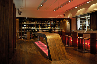
One level lower (-4,00 m), the toilettes for customers and smoking room are placed. The design is simple and minimalistic and it builds on simplicity, hidden details and light. Six meters under street level is situated a wine bar. The aim was to create similar feeling as in wine cellars, but not to literally. A lot of wood is used on floor, ceiling, doors, and furniture. The main element is console wine table in length of seven meters. It’s made of steel and wrapped in solid wood. Opposite to the table is a bar counter made from visible concrete. Behind him is a visible wine cellar with 1500 different sorts off wine. Lounge area with low seating elements is situated near staircases in the open volume of glass façade. Low seating element are putted next to six meters high wall claded in tiles. Modern chandeliers break seriousness and introduce a bit of kitsch. At the back of the wine bar vertical and inclined wooden ribs are used as shelves for presentation of selected products of Slovenian cuisine (jam’s, olive oil, vinegar, cheese, chocolate etc.). Wine bar offers as well a VIP space for closed groups which can be separated from others with revolving doors made of wood and leather.
Great attention was paid to quality lighting of the space to create various atmospheres and light scenarios. Source of light changes location from ceiling to floor, from direct to indirect lighting also to lighting objects. (Text: Architekt:innen)
Für den Beitrag verantwortlich: Architekturarchiv Slowenien
Ansprechpartner:in für diese Seite: nextroom


