Bauwerk
Schulanlage Hirzenbach
Boltshauser Architekten - Zürich (CH) - 2007

Hirzenbach School extension
Roger Boltshauser employs „precision adjustments“ in his extension to a 1950s school building.
16. April 2008 - Axel Simon
Built between 1955 and 1965, the dormitory suburb of Zurich-Hirzenbach features point and slab high-rises and few low public buildings. At the time, the development was hailed by the city of Zurich for its exemplary architecture; today it is a social hot spot. The school in its midst was built by Charles Steinmann in 1959. Its buildings and grounds were badly in need of renovation and a competition was held for a new kindergarten and day care centre as well as a double gym and additional classrooms.
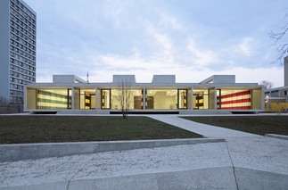
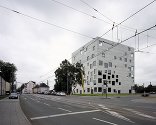
Although most people have trouble feeling any sympathy for the functionalist architecture of this suburban development and school, Roger Boltshauser managed to do so – and won the competition. His two annexes, north and south of the existing school building, pick up the strictly orthogonal alignment of the suburb and submit to its logic with their low forms. It is not through their height that these carefully calibrated public buildings stand out from the residential blocks, but through the very opposite: their horizontal spread.
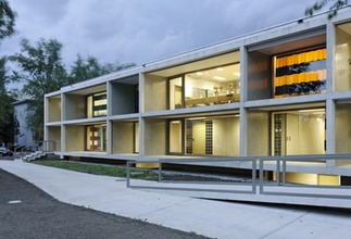
The annexes took their cue not only from the suburban development but also from the architectural grammar of the existing school building. In the new buildings the concrete structural grid extends into the third dimension: deep concrete frames protruding slightly above ground level provide permanent sun protection and create a spatial transition between indoors and the unstructured outdoor space. Thanks to these storey-high brise-soleils, the building volumes appear almost to float.
A fond homage to the modernist district is also apparent in the large, box-shaped skylights which enlarge the rooms in a similar way to the brise-soleils and mould the incident light. They also shape the buildings’ flat exteriors, lending them a sculptural force and appearing to repeat the surrounding development in miniature on both rooftops. Thus the new architecture’s most striking elements – concrete grid and skylight boxes – echo the existing architecture and in so doing turn the deficiencies of functionalist planning into good architectural quality.
The aforementioned light management, the extension of space outwards and upwards together with the well-judged spatial proportions, give the interiors of these buildings their unexcited matter-of-factness. A wide variety of educational situations becomes possible in the kindergarten building, for instance, through the group rooms that can be added by means of sliding doors or through the fully usable hallways. The kindergarten’s small courtyard flows into a roofed-over play and entrance area which provides access to the kindergarten on the left and the day care centre on the right.
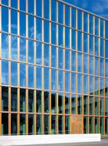
The entrance and the courtyard can be separated from one other by a sliding lattice gate. The use of such an ordinary grille at this most public part of the institution and not – as is customary nowadays – a CNC lasered, organoid, pixelated something-or-other, is typical of the overall architectural approach. The chief materials are exposed concrete and glass blocks, which are used both for the kindergarten building’s longitudinal facades and for internal walls. The other materials and their subdued palette of colours are also geared to a robust, everyday world: warm grey linoleum in the classrooms, reddish-brown asphalt tiles in the halls, dark grey synthetic stone sinks, greenish glass mosaics and an olive shade for the surfaces of cupboards and shelves enlivened by the merest traces of pale turquoise. Rather than anticipating the children’s presumably colourful everyday experience, these sober colours serve as a background for it.
In addition to the brise-soleils and the skylight boxes, there is one other design element that not only underscores the massiveness of the buildings but also has an impact on the atmosphere of the indoor spaces: the curtains by the artist Alex Herter. With their broad horizontal stripes in green/white, red/white or yellow/black they function as sunshades, screens or tent-like rooms within rooms. Depending on the colour combination, they suggest connections or create interesting spatial tensions.
On the three window facades of the gym – one-third of which is below ground level so that it appears to only two storeys high – curtains were dispensed with. In the concrete grid on the front of this building the windows bulge slightly outward, angling at the point where the casements and glazing meet. The glass mosaic-covered side walls of the brise-soleils are also slightly bevelled. The aim of such barely perceivable shifts, which the architect calls „precision adjustments“, is to make the attached concrete grid look as if it is an integral part of the building. And thus we gradually become aware of the source of these low buildings’ forceful appearance – not Hirzenbach after all, but works of architecture a few hundred years older.
Für den Beitrag verantwortlich: A10
Ansprechpartner:in für diese Seite: Hans Ibelings
