Bauwerk
Golfclub Sempachersee
Smolenicky & Partner - Hildisrieden (CH)

Golf club, Sempachersee
Joseph Smolenicky realizes one of the first Analogue works.
15. Mai 2008 - Axel Simon
With its most recent expansion, Golf Sempachersee near Lucerne became Switzerland’s largest golf course in terms of area. Driving up to the new clubhouse, architecture enthusiasts are reminded of an icon of Expressionist architecture: Erich Mendelsohn’s hat factory in Luckenwalde. Here too a massive „hat“ of a roof towers above an otherwise low body of a building. Initiates, however, also see another model: that of Analogue Architecture, a very influential theory developed in the 1980s by Fabio Reinhardt and his senior research assistant Miroslav Sik at ETH Zurich. The nostalgic gaze of the Analogues focused on architectural history and the homeland, rejecting the Modernism still predominating at that university. Hardly anything in the style of their designs, depicted in large oil-pastel paintings in great detail and gloomy tones, found its way into real life. This clubhouse by Joseph Smolenicky, first a student then an assistant of Reinhardt, can be regarded as one of the first built Analogue works.
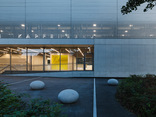
The building enthroned high above Lake Sempach is expressive in appearance but was nevertheless conceived from the inside out. The shape of its ground plan is completely irregular, and the walls – painted a different colour on each side – lead a screen-like life of their own without right angles. They each run out from under the roof-hat’s brim and brace themselves against the slope with their slanted ends. These walls shape the rooms – half are reserved for club members, half are open to the public – around the large core. This contains the „back of house“, in particular the very spacious kitchen serving not only the two restaurants and a large, divisible hall, but also the conference room underneath, a total capacity of 450 guests. The roof-hat’s crown over the kitchen conceals the all the building services.
What a roof! The architect chose it because the client wanted the „atmosphere of a small Grand Hotel“. Although the building with its almost 60-metre length is not small, it is only one storey high, at least on the entrance side. Even so, the heightened silhouette lends, if not grandeur, at least power. The interior does justice to the pretensions of the sport of golf – in a very sporty style. Casual elegance is what you might call it in the world of fashion. Bold colours in good taste define the rooms; a lot of white-painted wood frames the surfaces and structures them, reading as joinery. Smoothness is nowhere to be found. The structures and patterns covering almost everything – such as the Oriental floral ornament in the red bar – pick up traditional motifs and bring them up to date with the help of furniture that changes from room to room. Backlighting the walls and ceilings of the restaurants and the lobby freshens and ennobles the familiar materials and forms, and accentuates the indoor surfaces vis à vis the fantastic view of the golf course, lake and mountains. There’s no denying that surfaces activated in this way seem oddly laboured, lose some of their substance, become visual background noise. Many an architect may not like that. Golfers, who have just spent hours on green expanses, maybe do.
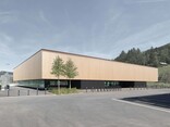
A few hundred metres away from the clubhouse, the rectangular red wooden maintenance building, reprises the roof motif somewhat more calmly. Between the two is the low reception building which also houses a shop and the secretary’s office; this the architect merely altered. Linking all three is an asphalt path with very wide, white-painted borders curving dynamically across the green terrain. The path and the house bring many an image to mind – of the sea, wide open spaces, the New England of Edward Hopper – and not only on the splendid wooden veranda of the conference room. If there’s one thing this cheerful work by Joseph Smolenicky is not, it’s gloomy - in that respect it is miles away from its architect’s beginnings. According to Smolenicky, there is a common conception of a golf club and he wanted to sweep it away. He has succeeded. After this building, who can still say what a golf club should look like?
Für den Beitrag verantwortlich: A10
Ansprechpartner:in für diese Seite: Hans Ibelings


