Bauwerk
Krüll-Ung Office
Építész Kaláka - Budapest (H) - 2007
9. November 2008 - Architekturarchiv Ungarn
„Where is a basin? For I would then start thawing into it, since I can only go into raptures over this small house.”
WérGidA, architecture blogger
„The surprising musicality of the playful elements is immediately striking for the visitor sensitive to details. The longer one gets to know it, the better he begins to like the vibrating, rhytmic harmony created by unusual components.”
Rita Petrik, Octogon
„The mission of an office building might be ostentation as well. Contrary to that, Krüll-Ung House keeps a low profile. It strikes from its surrounding only by its handling of materials and by its glaring architectural quality.”
Viktor Rozmann, Atrium
„Quality is also evident in the elaborated detailing: the professionalism which can only be acquired by a designer is making itself felt. (…) It appears as if there were still many other sentences suppressed in the creators. I would like to believe that everything they have to say for us shall be expressed in their designs in the next few years. Because the liberation of creators is a common issue. Actually, the quality of our man-made environment depends on it.”
Krisztina Somogyi, Hungarian Architecture
Our client was a firm specialized on planning and carrying out of sun protection systems. We were expected to plan a building which would not only host the head office but also become an emblem of the firm’s philosophy of uncomprimising devotion to quality. The house intends to demonstrate a harmonic unity of architecture and shading technology instead of being tricked up by forced decorating elements. We were encouraged to find solutions that need more mental energy investment rather than physical so that running costs could be reduced.
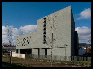
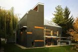
The building site lies in a confused outer area of Budapest. The longer street side of the acute-angled trapezoid corner site follows an esplanade and cycle path along the Danube bank while, the shorter one faces a warehouse area. The fourth side neighbours a small house suburban surrounding. The area being architecturally mixed, we wanted to create something of quality which would also look a novelty as against the adapting. We opted for a sculpture-like, conspicuous outer shape which would mark the building off from its environment. The two street sides of the house look like a solid but textured mass that has been punched and crushed here and there. On the other hand, the opposite long side opens widely to an intimate garden enclosed by an existent house beside. The mass of the building fills up the space allowed by the building regulations while leaves inner terraces (i.e. hidden outer spaces) beside the functional rooms within the strict outlines.
The building with a total net area of 800 squaremetres is articulated in terms of its functions. The single-space offices in the first two storeys have natural light from both sides. Direct contact with the garden is an evidence on the ground floor. Shot through with looplights, the outer wall conceals an intimate terrace on the first floor as well while, on the second, provides access to a terrace combined with a roof garden.
We were enthusiastic to look for ecologically-minded solutions. Elements of environment-conscious architecture include the powerful heat insulation of the outer walls as well as windows, the slab cooling system with water provided from a well, the green roofs, the venetian blinds shading of glass surfaces. There is no need for air-conditioning as the demand for heating can be kept low.
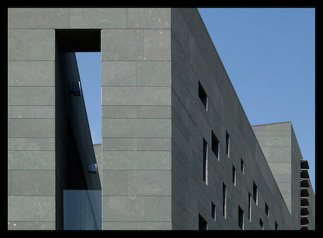
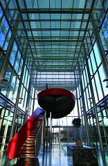
The facade features finely textured greenish grey stone, glass surfaces and metal slats which can be drawn up behind the covering. The elevation facing the Danube draws attention by a stripe made of turnable stone slats which blend into the surface when close. The interiors are free of all redundancies and they feature pure materials and selected colours.
Für den Beitrag verantwortlich: Architekturarchiv Ungarn
Ansprechpartner:in für diese Seite: nextroom
Akteure
ArchitekturBauherrschaft
Krüll-Ung Kft
Tragwerksplanung
Landschaftsarchitektur
